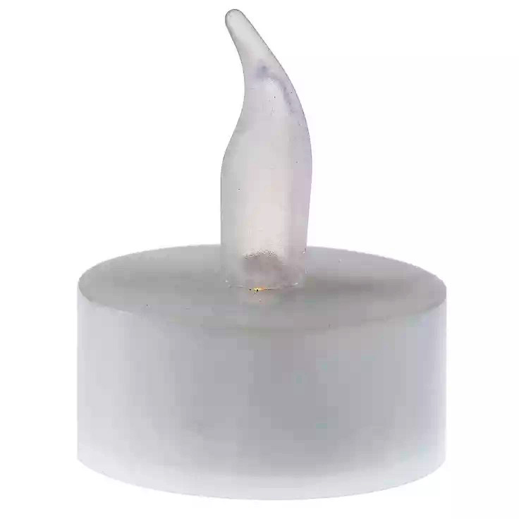
First, a trip around Maggie’s Farm. The Hobby Lobby tea light above is a skeuomorph.
What were necessary parts of the design of an older tool – the tea candle – are represented as ornamentation in this tool to convey meaning: about how to use the tool and the setting in which it will provide an emotional return.
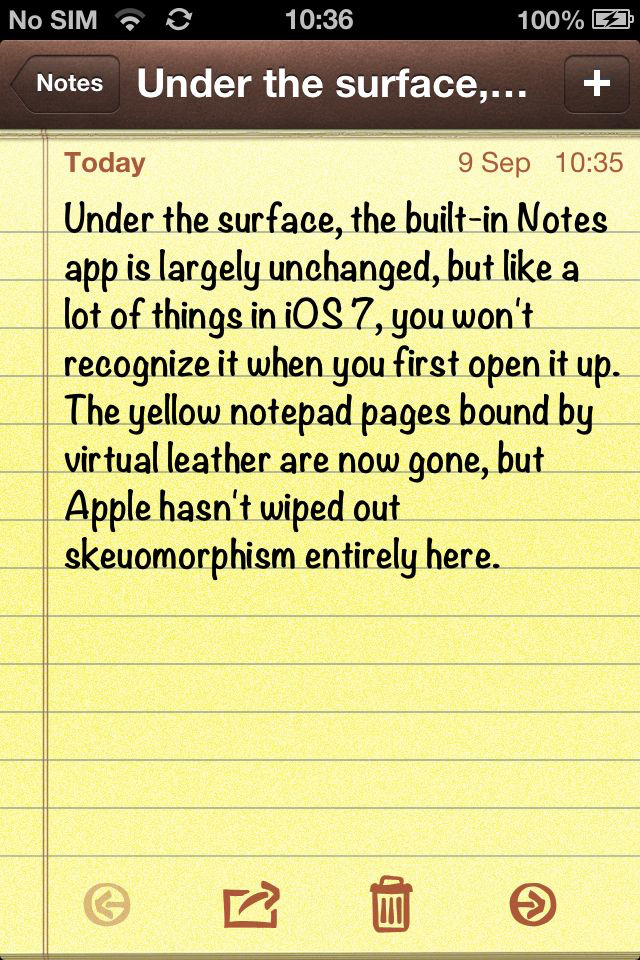
In the iPhone’s early releases, a lot of apps were pregnant with skeuomorphisms. If you’re a current iPhone user, open the Notes app – the icon of which still resembles a notepad – and look at how bare-bones it is. With the 2013 release of iOS 7, codename: Tuxedo Cat (don’t quote me on that) Apple got rid of the old skeuomorph. (Image: Cult of Mac.)

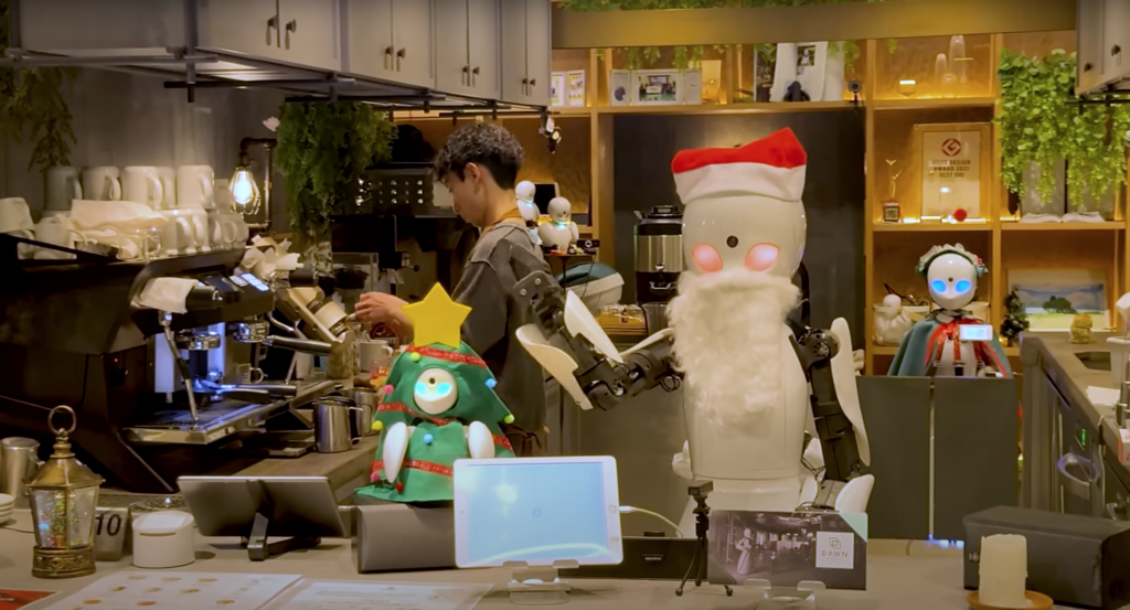
Now that we’re around the farm, Dami Lee (or DamiLee) is a Vancouver-based architect and YouTuber who frequently integrates pop culture in her discussions about public spaces and architecture. In this episode, Dami and her team explore Dawn, a cafe in Tokyo that is staffed by robots.
These robots, called orihime, are not autonomous. They are remotely piloted by people who suffer from mobility challenges. It’s a win-win system that demonstrates a way for Japan to deal with its shrinking workforce while providing rewarding human interaction for those whose health has kept them out of human spaces.
In robotics and AI, a lot of our design ambition is to make things do and say more. “We” are in a rush to create cyborgs and AI that resemble humans as much as possible. Deep fakes. Apparel companies using AI-generated models. The voices in so many narrated videos.
Yet, in an interview late in his life, the astrophysicist Stephen Hawking was asked why he still used the same Speak and Spell-sounding digitized voice he’d been using since the 1970s. “It’s my voice, now,” he said. It was, to him – and everyone else – how he sounded … it was … him.
Similarly, the robots in the Tokyo cafe are very basic, not just to bring down the cost and make the devices more affordable for more applications, but to stay out of the way of the pilot. Rather than complex software and hardware designed to poorly simulate complex facial expressions, the pilots are engaged in creating the gestures they wish to convey and to sync it along with their voices. And, it is adorable. It is more human than the chilling not-faces of more realistic machinery because it isn’t burdened by the weight of artificial ornamentation. Skeuomorphisms like noses, moving lips and detailed eyes are eliminated or paired down, allowing the pilot’s humanity to come through.

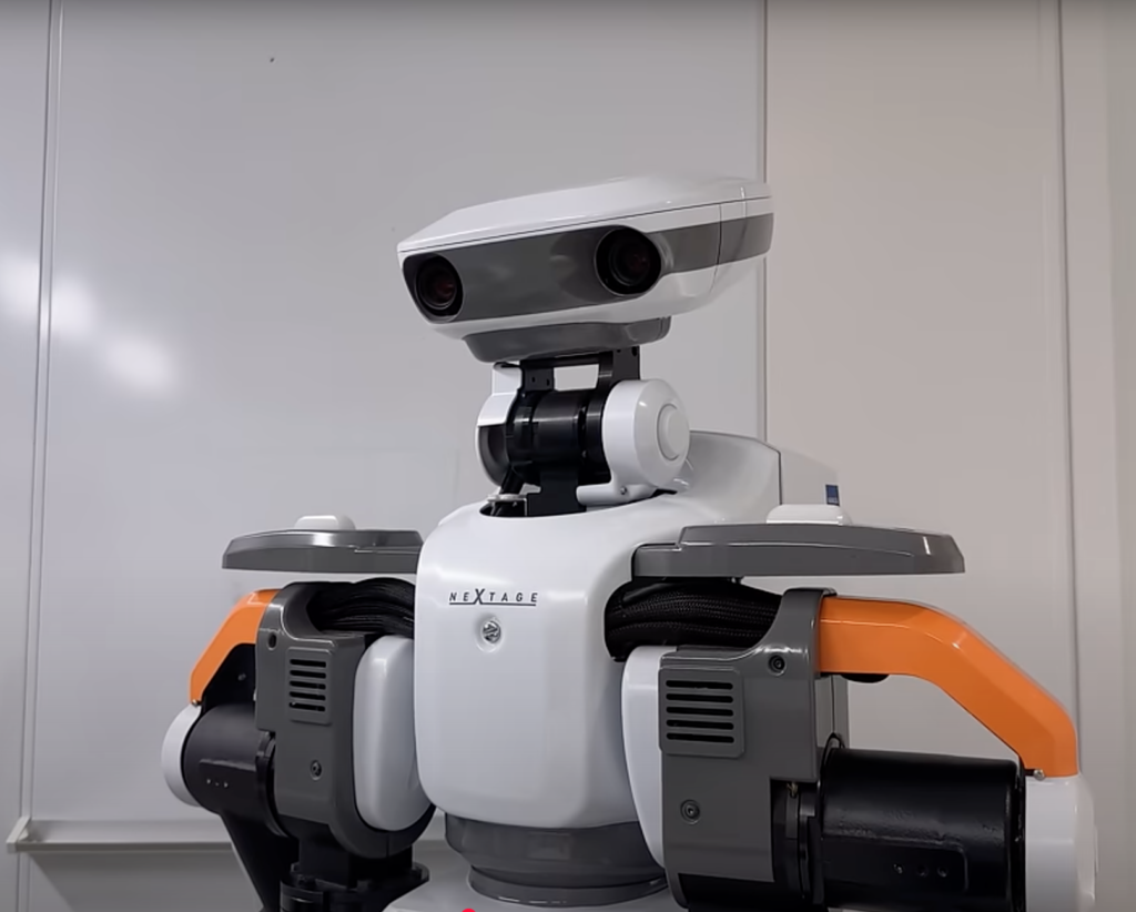
A not very smart Kawada Robotics device designed with removable “hands” that can be tailored to specific tasks. Like making and pouring French press coffee. Capture from Dami Lee.
DAMI LEE: “Despite being human-sized, Kawada-san had a very strong opinion on what the robot should look like.
“These robots, they look like robots. They don’t look … or I don’t think they’re trying to resemble anything like a human. Is that an intentional design choice or more like economical.”
KAWADA-SAN: “Yes. A robot is a tool. A tool should look like a tool. But, for [an] industrial robot, it should say what it cannot do. I mean, the robot is not very smart. That’s why the head is so small. It has two arms, so it is predictable how it moves. To answer your question, the appearance is very intentional.”
That is genius.
Too often, we overburden our products with visual and functional ornamentation they not only don’t need, but actually get in the way of enabling the tool. I realize that this is the irritation I have with so much software. Microsoft Word is still designed around the logic and skeuomorphs of a typewriter – an object that fewer of its users have ever touched as the years roll on. Its linear behavior is damnably frustrating, especially when people insist on using it as a desktop publishing platform — which its designers have encouraged with new tools and their promises. That’s why tools like the reMarkable tablet and Google Docs – in which I’m composing this – have become popular.
Now, I find myself looking for ways to achieve more from the designs of products I’m involved with by stripping them down, by wanting to shun the easy line extension in favor of deeper use cases for existing products. Rather than adding a new flavor, how can we make the fundamental things better and more intentional to enable users to make and do more of what they love?
Watch the video and try not to get a little weepy at the end.

Pilots and their orihime at Dawn. Capture from Dami Lee.